

Every piece of art co-exists in a space that inspires and is inspired. With Global Steel, we have been inspired by old cartoons. How old? The cartoons of the ’80s. Remember The Centurions? He-Man? How about M.A.S.K.?
In this blog entry, we break down aspects of ‘80s animation that motivate our approach to animating features of the game.
Before we dive into things, note that we will refer to a lot of ‘1’s and ‘2’s. In the animation world, 1s mean every single frame is unique, so at 24 frames per second you’ll have 24 unique drawings within that second. 2s mean that an image holds for two frames, rather than one. So, if we were to animate one second at 24 frames per second on twos, it means every other frame will be unique.
The Walks
Though He-Man is a very good example of smooth, and rotoscopic walk cycles, every hero and villain has the same animation. For our game, the inspiration for walks is taken from cartoons like Dungeons and Dragons and M.A.S.K. Those shows had a more general approach with lesser frames and were non-rotoscopic. This allowed every character to have their own animation depending on the sequence.


In our game, the walk looks more natural as it is in 2s based on The Visionaries. The style also comes very close to that used in the 90s. This makes for the perfect combo of consistency, 3-dimensionality, and detail.

The Runs
The runs in these TV shows are in 2s (except in He-Man, where kids run in 2s while adults run in 1s).

We wanted to avoid players feeling bored with slow gameplay. So we decided to go with faster run cycles for important characters. Cheetara from Thundercats was the perfect reference for what we were trying to achieve. In the Thundercats opening there is a sequence where Cheetara runs across a group of monsters in the Thundercats opening. Her upper body bends forward to show aero dynamism, as well as the frames in it. As a result it looks smooth and aggressive.

We mixed Cheetara’s running posture with a mixture of 1s and 2s for all the main character and boss running sequences while the other lower tier grunt enemies have their sequences in 2s.


Morphisms/Transformations
In western cartoons from the ‘80s, the transformations are quick with white flashes while the silhouette morphs into a different shape. While in anime transformations involve the body expanding and contracting.

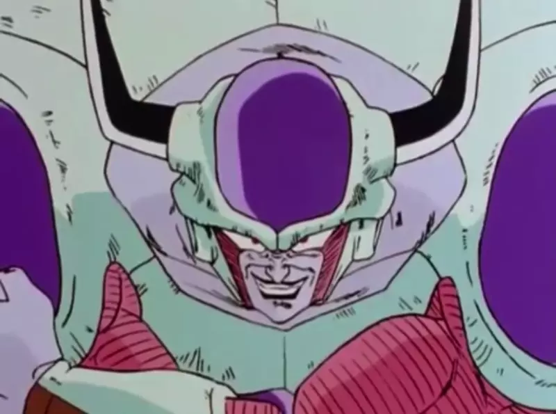
The Incredible Hulk was the perfect reference for our game as it combines the best of both worlds. It incorporates more consistency, progressive transformation, and character acting. All of this in a limited fashion which was common in the ’80s.

For one of our bosses, we have incorporated character acting and impactful energy waves, along with smoke FX enveloping them which creates an overall 3D feel. Furthermore, it makes the sequence more dynamic.
FX
The FX animations in western cartoons of the ’80s are bubblier and round, catering to children. In anime, smoke and impact FX tend to have a sharper/triangular shape to make the effect more serious and violent.


Thankfully, there are sequences from The Centurions and The Visionaries which blend well with the Japanese-themed style of one of the studios known as TMS (Tokyo Movie Shinsha). They are responsible for The Centurions and Spiderman. It is an important studio to keep in mind when it comes to taking inspiration.

Other than that, anime like Dragon Ball Z, City Hunter, Sailor Moon and Yu Yu Hakusho are some prime examples for FX animations.
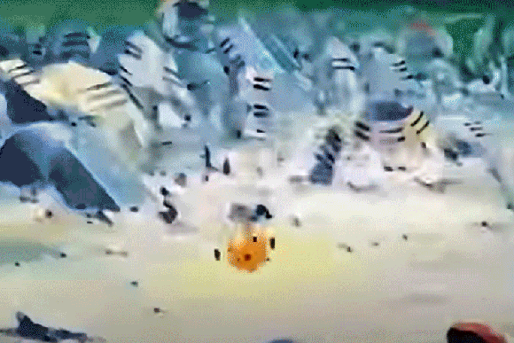
From Dragon Ball Z.

Character design
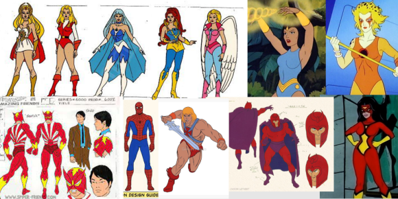
The ‘80s and ‘90s characters always depended on realistic proportions and facial features as if a real person were a cartoon. He-Man and Fire and Ice represent this style well. They used rotoscopic animation to support this life-like style. But, later cartoons produced by Japanese studios like Toei Animation and TMS Studios went for a more limited approach. Hence, they enhanced the details via shading while reducing the number of frames and making the animation more consistent.


Body design
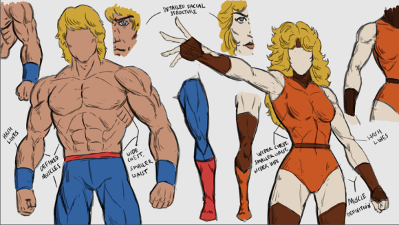
The 80s character physiques were modeled to match the conventional perception of an ‘ideal physique’. The men possessed buff, wide chests and smaller waists and broad shoulders, making them look barbaric. The women had strong but slender physiques. While they had a wider chest and well-toned arms and legs with thick thighs, their waists were really thin, making them look like a pristine hourglass. Contours are defined through hash-lines with line weight and the figures do not needing shading.

Backgrounds
When it comes to the backgrounds of the ‘80s, every background was hand painted via poster colours on textured paper and blended really well while keeping them saturated and poppy. The backgrounds often had gradients and strong values indicating tints and shades without any sharpness.
Foreground elements would be cleaner and brighter with more saturation (often without shading) so that they stand out from the heavily textured and shaded backgrounds.

This way, the animators can just focus on the base colours of the characters and not spend their time shading the characters. Meanwhile, the background painters can go all out on one image making the overall production chain faster.

—
Stay tuned for our latest updates on social media platforms.
Twitter | Facebook | Instagram
Wishlist the game on Steam!
Written by Aayush Ray Chaudhuri (Art | Animation)
Edited by Tanay Sharma (UX | Manager)